Skip to Content
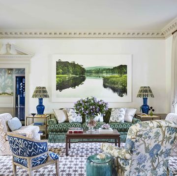
turquoise living roompinterest
asbe//Getty Images

10 Paint Colors That Can Make Your House Look Cheap, According to Designers

You might want to rethink that shade of blue.

By

While paint colors can oftentimes be a subjective choice—for example, one person may love a particular shade of green while someone else doesn’t care for it—there are some hues that win out over others when it comes to elevating the look of a home. There are some colors that designers say make interiors look more expensive, and then there are those that the pros say can actually make a home look “cheap.”

There can be several reasons why you may not want your spaces to appear cheap. Perhaps you’re looking to sell your home in the near future and want to boost resale value, or you just want your interiors to look their very best as you enjoy your home. Not to mention, using cheap paint colors can potentially cause an unwanted domino effect for other aspects of your home.

“If a home looks cheap, there’s a feeling that things are going to break anytime, that nothing has any value, and people don’t care as much about their stuff,” says Christine Kohut, owner of the New Hampshire-based Christine Kohut Interiors. “That can lead to being lazy about maintaining things, or even just keeping it clean and organized.”

She goes on to say that people who visit may feel that same energy and attach that to the homeowner. Kohut adds, “From a selling standpoint, buyers will think that the homeowner hasn’t taken good care of the home and will expect there to be a lot wrong with the place.”

Joni Burden, executive chairman and creative director of J. Banks Design in Hilton Head, South Carolina, agrees with this thinking, saying, “The most obvious reason for someone wanting a home to look expensive is resale value. If it looks expensive, then someone might be willing to pay more for it.”

At the end of the day, it’s really up to you and your individual tastes when choosing a particular paint color. If a “cheap” paint color is one that happens to bring you joy, go for it. As Kohut says, all colors can look good when the natural lighting of a space and the relationship to other things in the room are considered, but some colors are easier to work with than others.

For colors that might be considered “cheap” and could be more difficult to work with in general, our experts have shared this list of picks.

Metallics

home interior
Nikada//Getty Images

While metallic walls aren’t exactly everywhere these days, from time to time, it is possible to spot a silver, gold, or bronze accent wall in a home. Referring to these shades as “bright metallics,” Burden says that these colors are appropriate for nightclubs, but not for homes. If you want to add some glamour to your space, opt for wallpaper with some sheen or beautiful metallic objets d' art.

Tuscan Yellow

modern living room interior with sofa
Vanit Janthra//Getty Images

Tuscan yellow, a color often found in Italy’s Tuscany region that became popular in the 1990s and 2000s, is a “darker, warmer yellow,” as Kohut describes it. The dusty shade would look stunning in an Italian villa, but may look a bit too intense and dated elsewhere. To decorate with yellow the right way, consider opting for more forgiving hues like ochre or buttercup—and always take your room's natural light into consideration.

Turquoise

turquoise living room
asbe//Getty Images

Turquoise is a paint color that can be quite divisive. Although it certainly looks spot-on within beach houses (it does emulate the color of the ocean, after all), it may be too much for everyday abodes. As Burden says, turquoise is great for jewelry, but not painting an entire room, since it can be overpowering.

Advertisement - Continue Reading Below

Beige with Pink Undertones

modern living room with sofa interior 3d rendering
Scovad//Getty Images

Kohut believes that beige with pink undertones is generally not a good paint choice in homes. Those pink undertones do have the potential to warm up a room instead of going with just straight beige, but it wanders too far from basic beige to be a neutral, and it can clash with decor. If you're wanting to paint your room a go-with-everything shade, opt for one of these designer-approved neutral paint colors instead.

Peach

modern classic peach beige interior with lounge chair, armchair, kitchen, dining table, carpet, floor lamp and mouldings 3d render illustration mock up
YKvision//Getty Images

Yes, “Peach Fuzz” is the 2024 Pantone Color of the Year, and when used correctly as a paint color, it can be quite pretty. But Burden says that this is a fussy color in general, and it can be tough to pick a shade of peach paint that isn’t too pink, orange, or doesn’t have the effect of a highlighter. The bottom line? You might want to sidestep this one as you choose a color for a whole room, unless you have a trusted designer to guide you.

Mint Green

elegant living room with sofa whole view colored wall background
Gladiathor//Getty Images

Kohut says mint green is one color that can make a space look cheap. Though it does have the potential to look great, it also can look different in varying amounts of light. This tricky shade sometimes looks green, while other times it can appear to be blue or even gray. A constantly shifting vibe in a room isn’t typically ideal. Instead, opt for one of these designer-approved green or blue paint colors.

Advertisement - Continue Reading Below

Dark Brown

warm and cozy living room interior with beige modular sofa, patterned pillow, brown plaid, wooden coffee table, books, stool, pitcher and personal accessories home decor template
FollowTheFlow//Getty Images

Sure, dark brown paint had a major moment in the 1990s and 2000s, but Burden says that choosing an outdated brown paint color is something that can cheapen a room in a hurry (the last thing you want is for your room to look dingy or muddy).

If you're set on going chocolate brown, opt for a high-gloss finish and use these designer tips for using brown paint the right way.

Baby Blue

fresh linens on the bed of in a robin's egg blue bedroom
Dana Hoff//Getty Images

Unless it's classic navy, blues can be tricky shades to work with—and this especially pertains to baby blue. Burden says that blues are difficult, and if you don’t choose the correct shade it can end up looking like a nursery (not ideal, unless that’s the exact room you're painting).

To nail the look, opt for one of these chic blue paint colors that always look great, and check out these tips on how to decorate with the calming shade like a designer.

Ho-Hum Gray

living room interior
izusek//Getty Images

Though gray is a popular paint color choice and can be pretty when used correclty, Burden is never a fan of “gray that looks like the color of sheetrock.” It’s a shade that can instantly bring down the mood of a room and make it look cheaper in the process. Instead, opt for a different gray or neutral paint color that can warm up your space and still act as a blank canvas.

Advertisement - Continue Reading Below

Any Bright Primary Colors

guinevere's antique shop
Andreas von Einsiedel//Getty Images

Although bright primary colors had their time in the 1980s, nowadays they are considered hues that can make a space look cheap. Kohut calls them “garishly bright primary colors,” and cites royal blue as an example of this. Burden also doesn’t love bright red. She calls it “a great accent color, but it can overwhelm a room and be off-putting.”

It's worth noting that when used correctly, primary paint colors can actually make your home look more expensive (think: a lacquered red library or glossy blue kitchen cabinets), but it can be tough to pull off without the help of a designer. Before pulling the trigger on a primary paint color, you should consider the paint's finish, the natural light you get in your room, and the rest of your decor.

Headshot of Shelby Deering
Shelby Deering

Shelby Deering is a lifestyle writer who specializes in decor, home tours, wellness, travel, vintage, and feel-good stories for national publications. She’s from Madison, Wisconsin, and when she’s not writing, you’ll find her running local trails, shopping flea markets, or going for walks with her husband and corgi.

Watch Next
 
preview for HDM All sections playlist - Veranda US:
Advertisement - Continue Reading Below

Designer Advice

a kitchen with a marble countertop

7 Details That Make Your Kitchen Look Expensive
a room with a fireplace and a door with a red door with the greenbrier in the background

Dorothy Draper Design School's 5 Best Tips
how to decorate with antique textiles alidad

How to Decorate with Antique Textiles
branford horry house in charleston, south carolina designed by jayne design studio

Retro vs. Vintage: What's the Difference?

Advertisement - Continue Reading Below