
25 Russian Propaganda Poster Designs Analyzed
Welcome to a special post on Pxleyes where we analyze the style of communist posters. This can be a good starting point for creating a poster ourselves as we’ll explore the best examples, repeating properties and recommend a few tutorials explaining the technique.
The purpose of communist propaganda was for the Communist party to connect with working class and market their ideas directly to people. Nowadays, its graphic style – constructivism – is used either as a parody or an art.
 One of these style characteristics is, of course, the message, which is short, clear and loud. Constructivism means graphic designers had to cut the elements out of paper by hand, so the forms aren’t very complicated. Find a typeface with little detail, preferably square and bold (Kremlin).
 Main colors we’re using while remaking the propaganda style are red and white. White is the color of background (although we can grunge it a bit with textures) while red is the main printed color. There are examples using shades of yellow and black and even green.
 Main motive pictured on the posters are people, mostly working class, because it could connect with the target group best. While this element of course doesn’t need to be included in your art, it’s nice to know something extra.
 This is something that won’t interfere with the message you’re trying to send with your poster – make sure the forms you’re using are simple. Imagine cutting out every single thing out of paper and sticking it together (actually, that’s a very good practice and could turn out pretty well). You’ll want to make everything as plain as possible. Also, if the design is too loud, it might drown out the message – the principle many contemporary advertisers are often forgetting.


Big Letters, Short Message
Red And White
Depiction of People
Simplified Forms
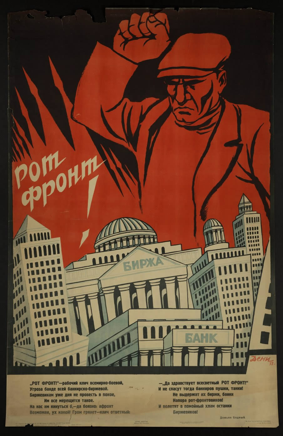
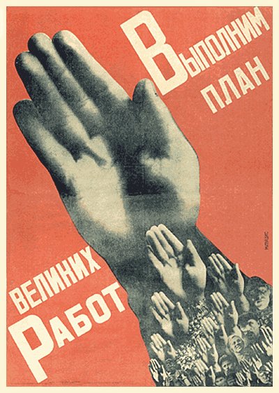
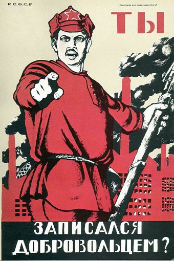
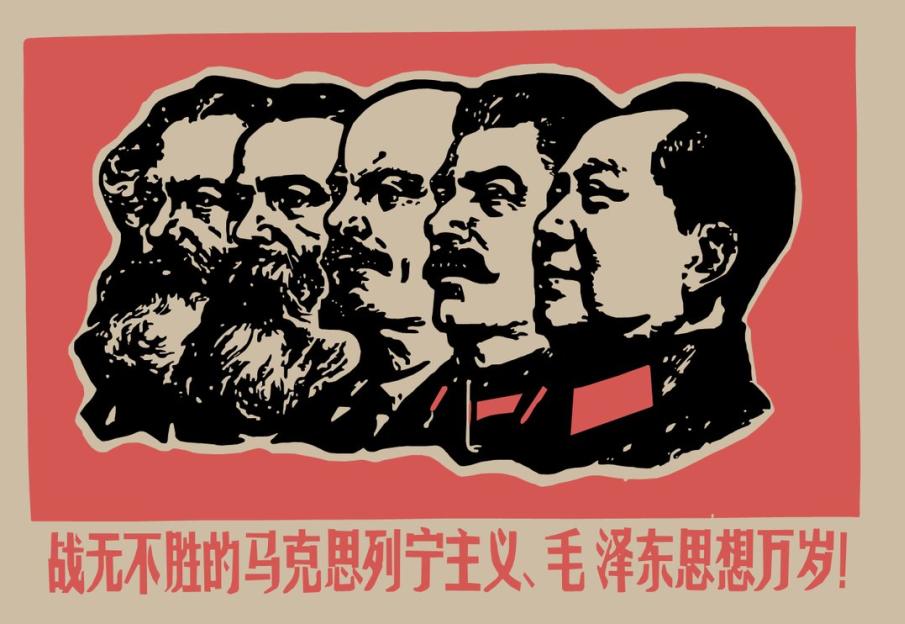
Communist poster #1
Translation: “We’ll execute the plan of the great works.“
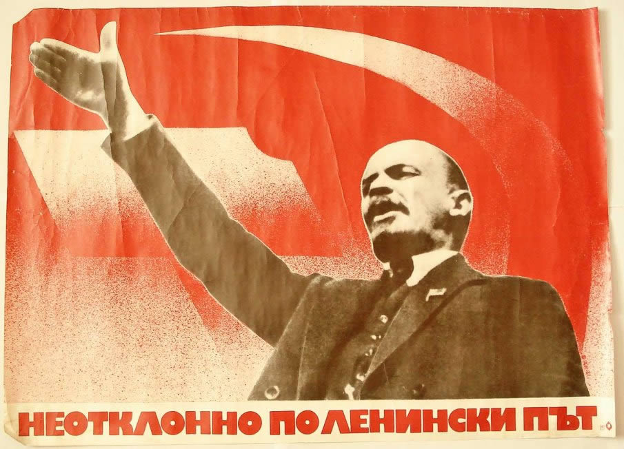
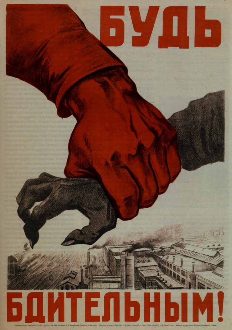
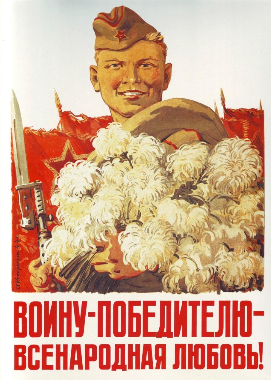
Communist poster #2
Translation: “Be on guard.“
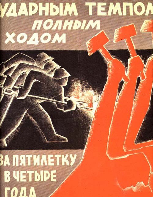
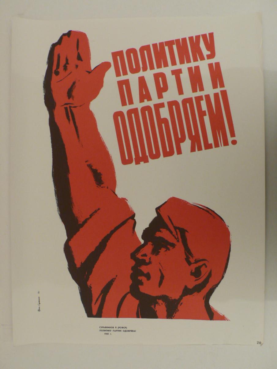
Communist poster #3
Translation: “Briskly, full speed ahead. Complete 5 year commitments in 4 years.“
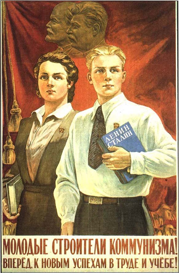
Communist poster #4
Translation: “Ballot box announces: “For the Motherland, for Stalin, for World Peace, for Communism.“
Communist poster #5
Translation: “We’ll give for the building of Socialism in 1931 … 8 million ton of raw iron.“
Communist poster #6
Translation: “Young builders of Communism, go forth toward the new heights (achievements) in education and labour.“
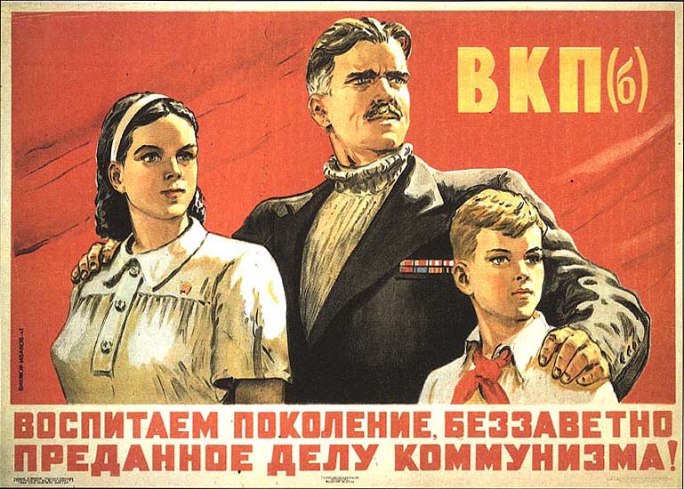
Communist poster #7
Translation: “We’ll raise a generation, selflessly loyal to Communism.“
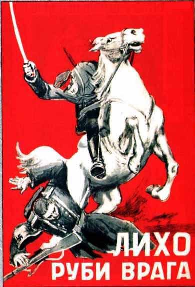
Communist poster #8
Translation: “Cut down your enemy with prejudice.“
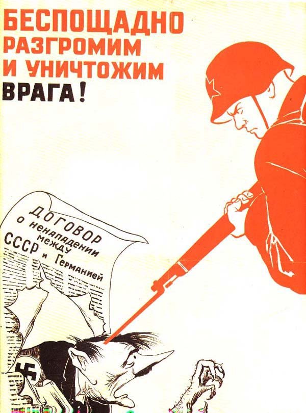
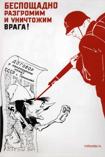
Communist poster #9
Translation: “Without pity, we’ll decimate and obliterate the enemy.“
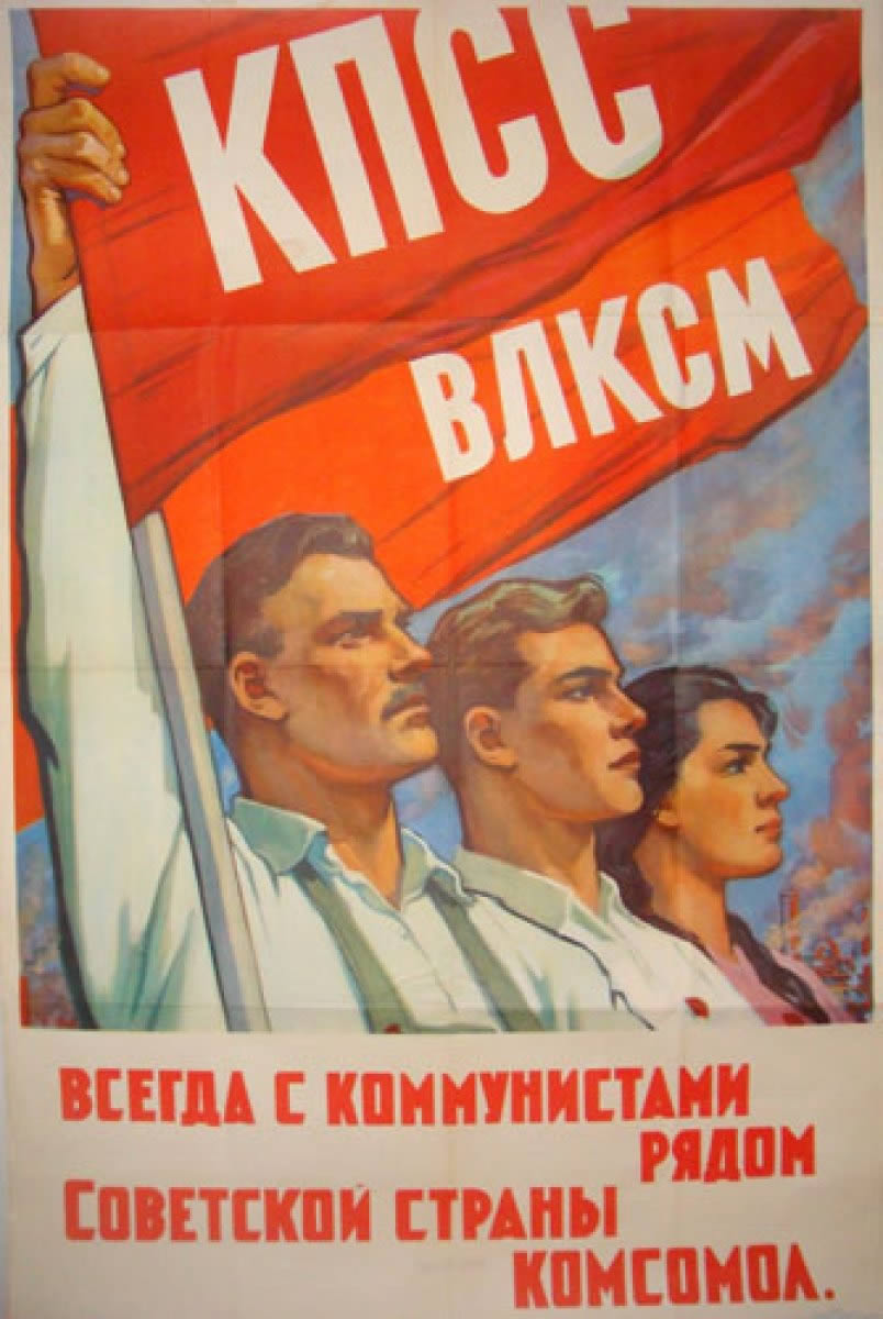
Communist poster #10
Communist poster #11
Communist poster #12
Communist poster #13
Communist poster #14
Communist poster #15
Communist poster #16
Communist poster #17
Communist poster #18
Communist poster #19
Communist poster #20
Communist poster #21
Tutorials to achieve this effect
Okay, now that we’ve got the theory, let’s look at some tutorials that will teach us how to achieve the effect. » Design Tutorial: Creating a Propaganda Poster on CreStock » Create a Constructivist Inspired Poster on PsdTuts » Gigposter Design: The New Sex on GoMediaZineAuthor: admin
Howdie stranger!
If you want to participate in our photoshop and photography contests, just:
LOGIN HERE or REGISTER FOR FREE
Comments Off on 25 Russian Propaganda Poster Designs Analyzed
Pxleyes
Photography and photoshop contests
We are a community of people with
a passion for photography, graphics and art in general.
Every day new photoshop
and photography contests are posted to compete in. We also have one weekly drawing contest
and one weekly 3D contest!
Participation is 100% free!
Just
register and get
started!
Good luck!
Follow us:


© 2015 Pxleyes.com. All rights reserved.